


a Concept for Reinventing MySpace
 MusicBizGuy
Most of the people that show up to a band’s MySpace page are not randomly browsing to find unknown music; rather they already have a specific (and rather obvious) purpose in mind (no specific order):
Purpose 1 - To get information or updates:
Fans want to stay updated. Casual fans want the essentials. Super fans want updates on everything.
Purpose 2 - To listen to an artist they already know about:
Previously recommended, or previously discovered, or entering your MySpace page via a Google search, fans are often clicking in to have a (another) listen.
Purpose 3 - To acquire or purchase something:
Fans may simply want to acquire or purchase something (a free download, tickets, merch, music, interactions, etc).
Purpose 4 - To interact with a specific artist:
Some fans want to personally interact with a band or with a band member; interactions can be free or premium (use your imagination).
Fans often want to GIGIGO
Most of the time, fans want to Get In, Get Information, and to Get Out (GIGIGO); they don’t want to get sucked into a rat hole of confusing graphics, spinning banner ads, ad-covered music players, fake friends and overwhelming choice.
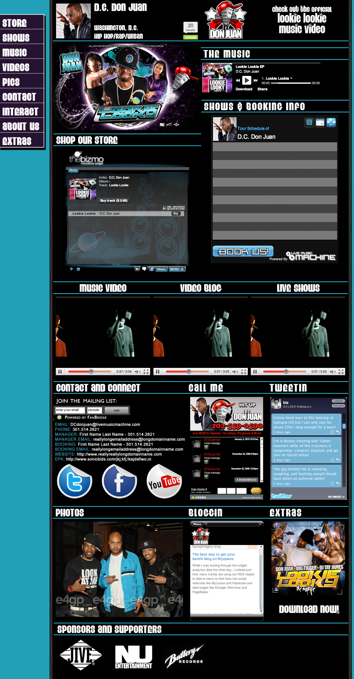
With all this in mind, I would like to present our concept (below) for MySpace:
Note: All display options are shown below. Artists will control how much or how little they want to show.
Please post your feedback and questions in the comments below:
If you would to help us make this MySpace concept a reality, please contact us at LiveMusicMachine: +1.443.552.0332
MySpace Concept Creators
- David Sherbow (MusicBizGuy) is a thirty-five year music industry veteran and the CEO of LiveMusicMachine.
- Cara Peckens is an experienced digital media strategist, a graphic artist and a partner at LiveMusicMachine.
Click the graphic below to view a full-size preview.
Reader Comments (21)
I get what you are trying to do, but my question is: why not just skip Myspace altogether and do this as your landing page on your own site? I've done that and have most, if not all, of this same info on my site, plus I have full control over the data and presentation. Plus, it's at a URL that's easy for people to find if they're looking for me already: christopherjoel.com. I can also work SEO to make my site show up near the top of the search results when people are trying to find me (like it does right now).
Personally, I haven't used my Myspace for anything in ages, I'm not sure why I would. Most people I know are on Facebook and I get more traffic there. If it weren't for the fact that many venues are consistently five years behind trends, I'd dump my Myspace.
I like the looks of this. I don't visit many MySpace webpages anymore just because of all the crap on it which is why I prefer to network on Facebook.
I like the preview of your "new myspace" - however I fail to see how this has any relationship with myspace: rather seems like you're hyping a potentially better alternative that would be livemusicmachine, no?
Christopher Joel
Thanks for your comment
Talent notwithstanding, there are tech savvy artists with the time, energy and resources to build and deploy a personal website. As you also well know there are many artists that need a simple but effective system to put them in the game immediately. We are targeting these artists and bands.
You are probably using WordPress which for those who want total control this is their best option. As far as search goes, MySpace pages usually come up at the top and do not require much search engine optimization, if any. With a navigation bar that moves with the user and with the really efficient design we have, users will be able to move quickly to whatever they want to find or do. Functionality and speed are the key today.
I see that your personal site comes up No. 1 and your MySpace page #2.
Also, in your scenario you have to do a lot more work to accomplish the control you want to have. More power to artists that want this control and know how to get it. Our design gives an artist almost as much control as you do and the ability to have this site up and running immediately.
Also whether they like it or not every artist on the planet that matters, including you, still has a page up on MySpace.
Chris I would also look at both your personal site and your MySpace page and decide if your designs are as effective as ours in quickly dispensing information or enabling sales.
Take Care
David Sherbow (MusicBizGuy)
I understand the concept you are working with here, but the graphic still looks like a clusterfuck of flashy stuff. The problem with myspace is that everything is crammed onto one page. An approach it doesn't seem like you have abandoned. Good job reinventing the wheel.
I thought there was a lot there also until I read this line above:
"Note: All display options are shown below. Artists will control how much or how little they want to show."
-Bruce
I like the idea of myspace.
I think the problem for music is, that you have just one website, where to put all informations. Who will read/watch/listen everything. To have more level to put your stuff would be nice.
Why an extra window for selling the music? You can put it somewhere to the windows with the music.
My big problem with MySpace is they alter code in strange & arbitrary ways. For example, the site for my record label can't have functioning paypal links, but the site for one of my more obscure projects can.
The problem with myspace is that everything is crammed onto one page.
For me that was always MySpace's best feature. I've done PR. marketing, and booking for artists. The people I approach (media, bookers) need to size up a band/artist in about 30 seconds. So I want everything immediately in front of them: music, bio, photos, video, show calendar.
I still like myspace for music and use it a lot, along with other sites like last.fm, blip.fm, 8tracks.com and youtube. It's no longer the best social network but it still has networking advantages over one's own webpage. It also provides a somewhat-consistent platform which is familiar to users, so we tend to know what to expect and where to find it. The option to customize myspace pages is both a major pro and con. I still prefer myspace visually over facebook, but myspace pages often become bloated bandwidth hogs, mine included, and this is often a problem even for those with fast machines and connections. Your design above does not appear significantly different from many current myspace pages, except for the absence of the long string of visitor comments, which is sometimes the main cause of overload. I would miss those html comments, but myspace surely has room for improvement in that area. I'm curious to know how you are handling the myspace advertising. I know it's ugly and evil, but, have you found a way to replace it? Are those the ads at the very bottom? If so, I'd like that, unless I was an advertiser. :) Thanks for this contribution to the music world. Food for thought.
I think ReverbNation has all of this proposals already done.
love Wofgang
Well, If you managed to get rid of the ads, and the comments section (which really slows down everything, unless you spend much time to clean it up constantly) AND the tabs to the left really work (funny that no-one here mentioned them...) then this is pretty amazing for a myspace layout.
I would def want one, if all mentioned above really happened....
I can understand that something needs changing about the way that Myspace operates it's music arm. However that graphic preview still appears too cluttered, maybe with a bit of tweaking with colours and layouts it would be a more attractive option. You might find this article interesting, from The Music Void, suggesting why Myspace will never compete with Spotify http://www.themusicvoid.com/2009/12/myspace-music-is-no-spotify-challenger/
OUR MOVING NAVIGATION BAR TOTALLY ROCKS AND REALLY WORKS !!!
What makes this reinvention of the MySpace artist profile unique, work flawlessly and with crazy efficiency is the left side navigation bar which which stays with you wherever you are on the page and enables anyone already on your page to have the ability to instantly move to anywhere else on your page that's important to that particular user. No more endless scrolling to locate what you want. Our design is stripped down with every element positioned so the moving navigation bar get to the right place with the right stuff on the whim of the user. If you are really interested in see our latest working model send an email to musicbizguy@yahoo.com.
Let's say you have a website, and its awesome. I bet you still have a MySpace page. Regardless of wether we like MySpace or not, the average person has been trained to first go to MySpace when they hear of a band/artist. Its a learned behavior. Joe told me about Band Zero, and I go to MySpace to listen to their songs.
We also live in a world where clicks are the enemy. You lose more than 50% of your potential customers each time they have to click to get to their end objective.
I go to a band's MySpace page. I listen to the songs, and decide I want to buy something. Here is my path to buy:
1. Search for your website link somewhere on your MySpace page.
2. Now I'm at your website. Now I have to locate your store.
3. Great, now I'm at your store. Now I have to find the product I want, and so often you end up directing me to somewhere off your website (iTunes, CDBaby, BigCartel).
That's a minimum of 3 clicks to buy. Every band/artist needs to make their MySpace page just as effective as their website. Make it easy for your fans. If they started at your MySpace page, let them buy from your MySpace page. Don't force them to go to your website; you're wasting their time. They want to give you money; make it easy for them.
Yes, MySpace can be limiting. It can be a huge pain to get setup. But you wouldn't have a MySpace page if it wasn't still relevant. So provide your fans with the best user experience you can within the limitations of MySpace. There are plethora of outstanding outside services with widgets that can transform your MySpace page in to a usable, revenue generating webpage.
I only use myspace to listen to music and check up on artist gig dates. Simplicity is key!
My two cents: I like the ordering of the items on the page, I like the sidebar, I like the reduced artist heading. Those are all things that drive me crazy on MySpace in its current setup. My suggestions: Tone down the flashiness, make the artist heading different from the rest so that it stands out, same with the contact info (reduce the size of the FB, Twitter, YouTube icons). You're on the right track... but as someone mentioned I think Reverb Nation may be a few steps ahead.
I agree with the concept. I do not want to make an advertisement here, and I very much do not like spamming - but you may check out my own site (which is not updated for a longer time and it is certainly not famous ;) ) here:
http://www.myspace.com/jwalkrmusic
and please just read the "About" section. ("Tired of myspace profiles loading for hours? Of pages slowing down your computer? Tired of tons of banners, slogans, videos etc?..." - and the rest follows there). Cheers.
I often tell colleagues and artists not to count out Myspace yet in terms of music. Of course Twitter and Facebook are the social kings, and for a couple of years I've thought of ReverbNation as the best kept secret in band management. However, in its simplest, most uncluttered form, a Myspace artist profile is the perfect snapshot and often if I like what I see or hear I will click on the link to a personal website. Also, unlike many of the other networks, it still allows you to initiate contact with potential fans (which people can opt out of being contacted). I am interested to see how this works out.
I think the myspace of Serj Tankian could be interesting for you: http://www.myspace.com/serjtankian
Of course he has a major label behind him, but I like the design and the ideas on his myspace.
Musicbizguy,
Have you seen what Reverb Nation has done lately with their update to artist pages? Its pretty close to your vision, but without all the customization and annoying ads etc.
They allow you to add wallpaper, choose which modules you want on the right side - inlcuding more than MySpace has- and more.
Seriously, check it out. If they keep revising the vision, they will be the ultimate IMHO.
Best thing about Reverb is that they actually answer emails and change the site if you make a strong case for a change. And they do it quickly. nuf said. I can't handle sites that don't listen to the users.