


How To Make A Music Website Like Ed Sheeran, Case Study Part 1
 Shaun Letang
Having your own website as a musician is vitally important, as it provides a piece to the sales funnel you simply can’t get with social sites like Facebook and Twitter. Add a mailing list to your site, and you’ll be able to find your most interactive and valuable fans much more easily.
That said, you need to structure your site correctly for it to have these benefits. All too often a good looking design is put up, and the site stays looking the same for the rest of it’s life. Just because it looks good though, it doesn’t mean it’s laid out properly for maximum fan conversions and retention. A bad layout and site structure can mean you’re not retaining anywhere near as many fans as you could have other wise, and your site may even be turning would be fans away. Both of these things lead to less buzz and income for you.
So how should you be laying out your website? Well, to help you better get a idea of what a good site structure looks like, I’ve picked a site I think does quite well in terms of getting fans interactive and keeping in contact with them.
The site in question is the Ed Sheeran website. If you’re not sure who that is, have a look at his website for the lowdown.
Here’s a look at Ed’s website’s home page as it is at the time of this case study. Click the image to see a larger one pop up in a new window:

As well as looking at what this site does well, I’m also going to look at what I would do differently and why.
The aim of this guide is to show you what goes into making a top website for your music career, mainly in terms of layout. If you’ve already got your own .com website (or .co.uk / .ca etc) then you can use this guide to help you better structure your existing site. If you haven’t already got a site (I’m not talking a Facebook page here), you really need one. I’ve already put out a guide on how to set up your own professional site quickly and easily, so if you haven’t got one yet, first get one sorted in the next 20 or so minutes using that guide. Then come back here for an idea of the structure you should implement.
So now you know what we’ll be doing, let’s have a look at what goes where on Ed Sheeran’s website and why.
The Video On The Front Page
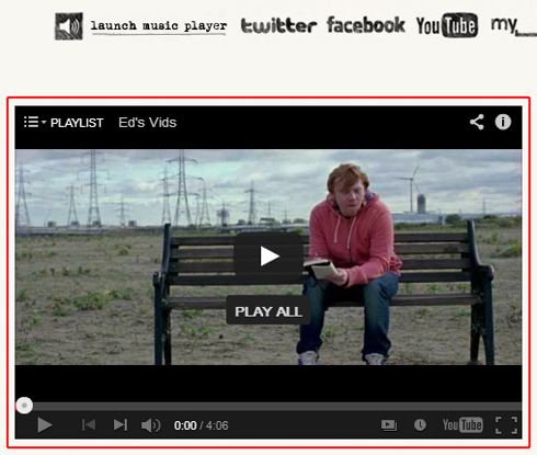 The first things I want to mention about Ed Sheeran’s website, is the video he displays near the top middle of his home page. This is what most people will instantly notice when they visit for the first time. Not only is it in a prominent position, but it’s also eye catching.
In this space, Ed puts his video playlist. The reason for this is simple: video is one of the best ways to get people interested in what you’re offering!
Think about it, how many times does it take you hearing a song before it sticks in your head? While it’ll only take one listen for some songs, in general it usually takes two, three or more. On the other hand, usually if you see a good video, you remember it instantly. It’s also a lot easier for most people to get hooked watching a video, over hearing a song for the very first time.
Of course this is generalizing as everyone takes in music differently. But as a general rule, video and music grabs people’s attention a lot quicker than plain audio does.
My bet is that this area is one of the most popular on the website’s home page.
One more thing to note about this area is that the embedded video also contains a playlist. So if you’ve seen the first video he displays, you’ve the option of looking through his other material either for something you haven’t seen before, or for your favorite song of his.
Social Boxes In The Right Sidebar
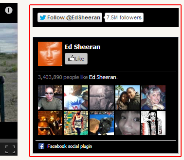 The next thing I want to look at are the social boxes in the right hand sidebar of his website. He displays a Facebook ‘like’ box showing how many Facebook fans he has, as well as a Twitter follow button above it at the top of the sidebar.
There are two main reasons for this:
- Social Proof.
People like reassurance that what they’re doing and what they’re into is socially acceptable. Social proof is a way of convincing people this is the case, and is a good way to get people to become a fan of your music much quicker. If you see that your friends has already liked Ed Sheeran’s facebook page for example, you’re more likely to click and like it yourself. And if you see that almost 3 and a half million people already do like him, most people would take that as a sign that he’s talented and worth looking into some more. Even if you haven’t heard his music before but then hear he’s got 3,404,045 Facebook fans (which he has at the time of writing this), chances are you’ll be that much more likely to think there’s something too him, and want to hear for yourself. - He’s Working On Building Up His Social Following.
When you’re building up your audience, it’s very important to retain the people that arrive on your website. If they come but you don’t get them either on your mailing list or social sites, the chances that you’ll get them on your site again will drop greatly. If you did get their contact details in some form however, you can contact them when something new and exciting is happening, and send a wave of your fans where you want them relatively easily.
While Ed has both the option to sign up to his mailing list and social sites on his website, he’s chosen to focus more on building up his social presence than collecting email addresses. This is shown by where he places both his social profiles and mailing list opt in box. His social profiles are near the top of the page in one of the first places people usually look (the top right hand side of the sidebar), while you have to scroll down the page to see his newsletter opt in box (also known as ‘below the fold’). On top of that, the mailing list sign up box is on the thinner left hand side sidebar.
I personally feel it’s better for musicians to focus evenly on both their mailing list and increasing their social presence, but you can do one or the other if you like. That said, I feel it’s possible for Ed to increase the amount of email addresses he collects without it affecting the growth of his social presence too much. I’ll explain how a little bit later.
The Top Nav Bar
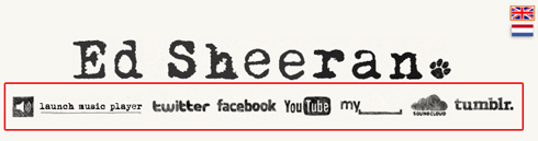 When internet surfers visit a website, they often expect to see the website’s navigation bar in one of two places:
- At the top under the header, or
- At the top of the left hand sidebar.
As a lesser rule, nav bars on the top right hand side of the sidebar are also becoming increasingly popular. If you don’t have your nav bar in one of these place, you’ll often confuse your website’s visitors more than you need to. And when your website confuses people, people leave.
In the space where the top navigation bar usually goes, Ed (or his website creator) has chosen to put two things:
- His music player.
- A link to all his social profiles.
Again, this shows that he’s actively building up his social presence. It’s not common for websites to have these kind of links directly under the header, so it shows he wants to get people to join his social sites wherever possible.
The music player provides visitors another way for people to listen to his music. Even though people have the option to view his videos when they first come on, not everyone has fast internet, and may not be able to play these videos for this or another reason. The music player helps with this; songs don’t take as much internet usage to play as videos do, so more people will be able to hear his material over if he was to display video alone.
What I’d Do Differently 1
As I’ll look into more later, his mailing list opt in box is a lot lower down the page in the left hand sidebar. The sidebar navigation is directly above that. I would personally take the social icons out of the top nav bar, and place the sidebar nav links in the area for the top nav. I’d then move the mailing list opt in form to the top of the left hand sidebar, and put the links to the social profiles below the mailing list opt in form in the left sidebar.
I’d do these things because, even though he’s mainly focusing on getting social followers, building up your mailing list is still very important. I’ve already looked at why this is and how to build your list here, so I won’t go into that again.
Ed already has his main social profiles prominently displayed on other parts of his website (Facebook, Twitter and Youtube), so having these links here seems to be a bit of a waste of space. By moving these links, he’ll still get his social sign ups from other parts of the website, but he’ll also most likely increase his list subscriber numbers as it’ll be in a much better position.
On top of this, by using the structure I mentioned, it’ll also mean he has links to his social profiles both above and below the fold. While it can’t be confirmed either way until tested, this may actually increase the amount of people he gets clicking over and signing up to his social sites.
The Side Navigation
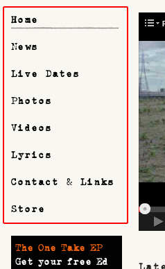 The next part of this music website we’ll look at is the left hand side navigation. I want to point out the order in which the links to each page are in. They go as follows:
- Home.
- News.
- Live Dates.
- Photos.
- Videos.
- Lyrics.
- Contact & Links.
- Store.
While a lot of things can be drawn from this ordering of pages, there’s one key things I want to point out: His store page is listed last!
Now while some may assume this is a bad move and that he should be trying to sell people things asap to make money from them, I disagree. I actually thing this layout is pretty smart.
All the links above the store page are there to get people to find out as much as they can about Ed Sheeran, and really buy into what he’s doing. They can hear his music, see his videos, see what the latest news with him is, see where they can see him live and the like. Then after they’ve taken all that in and are now a real fan of his (if they’ve got that far and are still browsing they can be classed as a fan), they’re directed to the shop page where they can buy some of his songs and merchandise. Of course, here he offers them some cool goodies they can’t get without coughing up the money.
If he was to send people straight from the home page to the store page, chance are a lot more of his visitors would ‘bounce’ off that page and leave without buying anything. By giving them knowledge and the chance to really buy into his movement however, he increases the chance that they’ll want to at one point get involved with him on a financial level.
By displaying your store page last, you won’t generally lose out on sales. If someone really wants to find your store before they’ve gone through every link, they will. So don’t be in a rush to sell straight away. That said, always give them the option to buy and make it easy for those who are ready to invest in your music. If you haven’t yet got something to buy on your website, you’re missing out on a big opportunity.
Side note: By Ed showing his live gig dates quite high up in the nav bar, not only is he encouraging people to come out and see him live, but that’s also another way he’s monetizing his music career. When you go onto his Live Dates page, you see both details of his live shows, as well as have the option to buy tickets to these shows in question. It’s not done in a forceful way, but the option is there for those who are ready to take that step.
How To Make A Music Website Like Ed Sheeran End Of Part 1
Even though we’re only half way, above you’ll find plenty of handy tips you can use and apply to your own music website. If you haven’t got a site yet, I suggest you make one right now using my guide on how to create a music website using Wordpress. In it I walk you through the steps which will get you a professional looking website up within 20 or so minutes. It’s the same process I used to make my own sites, so give it a go.
Next week I’ll post part two of the guide, and look at the remaining features of Ed Sheeran’s website. What it does well, and the areas I feel it can improve on. If you want to be informed of when that’s out, be sure to sign up to my newsletter here. You’ll also get a free ebook on music marketing for doing so. :)
Shaun Letang,
Music Industry How To.
Reader Comments (10)
Great post!
Excellent post! One of my band clients is just starting to work on their site. I've given them many recommendations, but you mentioned a couple of things I hadn't considered (i.e. putting store page last - I'd most likely have suggested it be placed below Live Dates or Videos). Valid point about putting it last!
I'm curious what you think of the pop-up that displays when one enters the site for the first time? I generally don't love pop-ups, but this one had some good elements to it (lots of options - then again, maybe too many for someone unfamiliar with his music?) so I have mixed feelings about it. Perhaps that will be covered in Part 2.
Also unsure about the font he chose. It looks cool, but is a bit difficult to read.
Look forward to Part 2 to see what you have to say about the other elements.
You give great advice, Shaun, which is why I always encourage my musician clients to follow you. :)
Cheers,
Carole
Thanks Aysh, glad it's useful!
Hey Shaun,
Recently I am planning to open a music website. I agree with your points "Social Boxes in the Right Sidebar" and "The Video on the Front Page". The article is quite helpful for me. Thanks for sharing this informative article.
Nice to see that you like this site.
When I project managed this build 2.5 years ago (!) for Atlantic Records UK it became one of the most visited artist websites in the UK. Warner Music eCommerce team made a killing with their native store plugged into the site.
Countering your argument on the positioning of the email sign up we actually drew in plenty of sign ups doing a cookie enabled splashpage driving the free EP over anything else. That was the first thing you saw going on site.
The only downside which we regretted with the developer we're the SEO related problems due to using ajax. This still persists today. Ajax did make it slick & quick to use.
The full mobile version was launched about a year after the site first launched.
Best,
Nikke
I really like your post... What I want to point out to you and my fellow readers is that just because you have a site and a well made site does not mean people will find you. This post was found not by me searching for it but by me being part of this community and receiving an EMAIL letting me know its here waiting. Email is still the strongest and most powerful way to build and interact with your fanbase. Being a Ed Sheeran fan I can tell you I didn't not find him through his site but through his YouTube and Soundcloud accounts. I then went to his site. Why do I point this out ? Well I want to add that you have to know where and who your fans are and give them what they want. Music by nature is subjective and abundant so we as fans move on quickly. Your site, YouTube, and Soundcloud accounts all have analytics which show you where your fans come from. If you are not good or interested in putting in the time to really look into these statistics find someone who is because you are too a large extent in the "Content" business. If you don't know how to speak to your audience they won't support you. Ed is part of a large Music company so most of his momentum was gained outside of the channels most artist have access to. Don't fear that though, you can compete and you should compete if you feel your music has a place in this world. Understanding your supporters is just as important and giving them a place to find you.
One other thing I wanted to add was that artist now must work at the experience people have when they visit the site. If most of your audience finds you on mobile devices then you must develop that experience first and then develop for tablets and the desktop. I for one find lots of music with my cellphone. So, when I want to learn more about a artist I will just hit a link to them from my phone. As I stated earlier, understanding your audience and where they come from and what devices they are using is very important. Yes your site is a big part of the experience but, if they get there and cannot get what they want easily they will go away and quickly. The days of just putting up a WordPress site and just leaving it are over, care should be taken to make sure that the Theme used works well on mobile devices. Mobile is now, those that don't take steps to make sure of this are working from behind.
Great analysis Shaun. Looking forward to part 2 (and 3?).
It's true that there is a whole bunch of psychology principles when it comes to creating a website, keeping it functional and clean cut, with great user experience and keeping the branding all along.
Useful insights on what you'd do differently, I totally agree with the signup form.
The nav bar, I'd keep it even more simple. If you're an artist that starts out, you have to keep it simple. When you have a lot of content to offer, then add some more tabs, as people will browse on your website for more.
Anyways, great one mate. Looking forward to the next one.
// Tommy
Re: Ed Sheeran Website...
I find this site very depressing to look at and left immediately. I like sites with plenty of colour and not the drab monotonous two-tone presentations that some artists find cool. I think the world needs to move on and brighten things up a bit to counterpoint the current economic climate.
Dave
@Carole: Thanks, glad you enjoyed the guide. :)
I do think pop ups are useful, but as long as they're not difficult to close and they look professional. Whenever I use them they always get me more sign ups, which leads to more traffic as I send them back to my site over time. I recommend them to all musicians I work with and most have kept them on due to getting more sign ups.
One thing I'd say though is you should have them appear say 10 seconds after people have entered the site, and make it a offer people will want even if they've just been introduced to your music on that day.
I hear what you're saying about the font, but I guess that's his personal branding. In this guide I'm going to focus more on the structure.
Thanks for recommending me Carole. :)
@Nikke: Hi Nikke, so you built the site? If so, thanks for stopping by and commenting. :)
I didn't see a squeeze page on the site, is that because I've already gone through it a while ago, or because it's not there anymore?
That's a shame about the SEO problems, good thing Ed's got a huge social following though. :)
Thanks for the comment.
@Steve: Steve, I agree with you 100%! Having a website without driving traffic to it is absolutely useful. You could have the best converting site in the world, but if no one visits it, it won't make any conversions.
That said, this guide is more about setting your site up so it's ready for traffic if you don't get any yet, or to improve your site so you get more sign ups etc if you've already got a site up and running. I've plenty of other guides which focus on marketing your music and website, there wasn't space to fit it all in this one guide though. But again, I agree about needing to drive traffic to your music website.
@Tommy Darker: Hi Tommy, thanks for the comment. Great tip about starting out with a smaller set of options then increasing them as your site becomes fuller, that'll also make your site easier to set up initially. There'll be at least one more guide, but I won't count a part 3 out if it's needed. :)
@Dave: Hi Dave, thanks for your comment. I guess the color is down to the personal branding Ed and / or his label picked out. I'm not going to focus on that in these guides, more the structure and what I feel works and doesn't. But thanks for the comment. :)